Public Portal search
Revamp of Libris clients’ Public Portal search experience to improve its discoverability and ease-of-use.
Roles
Direction
Research
UI/UX Design
Date
October 2018
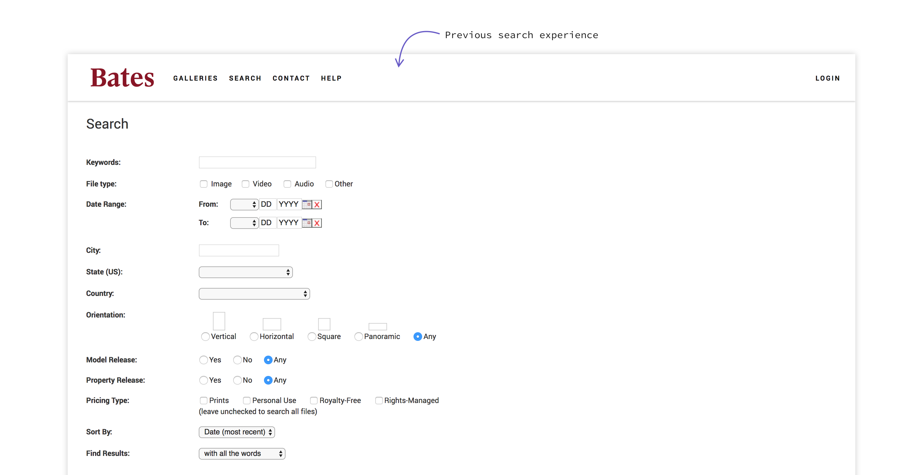
The Libris Public Portal search experience was in dire need of a user experience revamp to improve its usability and a visual design upgrade to match the PhotoShelter pattern library styles. While the previous build had that "retro" 90s internet throwback feel, we wanted to bring the style and experience up to speed with modern expectations.
Organizations use the Public Portal to distribute images, videos and other files to individuals and teams within and outside of the organization. Assets made available on the portal are regularly downloaded for a wide variety of uses, such as in social media marketing or to create a new brochure. For many organizations, their libraries consist of thousands upon thousands of digital assets made available to the public and invited users. Thus, Public Portal visitors often have to navigate a large volume of content to find what they need. For this reason, the search experience needed to be optimized to make searching content easily accessible and fast.
Project goals
The search revamp focused on:
- Improving discoverability
- Updating the UI
- Increasing speed
- Avoiding dead ends / 0 results searches
- Defaulting to content the user can download
User flows
The team wanted to get a better understanding of the current experience before jumping to the prototyping phase. To facilitate this discussion, I created a series of user flow charts highlighting three different persona user flows:
- Public visitor (logged out)
- Invited user (logged in)
- Admin (logged in)
From there, the product manager and I highlighted specific areas in the flow that could be redesigned to avoid dead ends, reduce clicks to access downloadable content, and make searching and filtering faster and more intuitive.
Recommendations
Remove single image "cul de sacs"
In the previous search experience, when a user clicks on a search result single asset within search results, they are taken to a separate single asset page. To get back to search results or to run a new search, the user needs to click "back to results." This greatly reduces the speed and ease of use.
Avoid "Access Denied" pages
In some instances, users arrive at "access denied" pages from assets that appear in search results. This is because the previous experience doesn't prompt users to log in until after they click to download an asset from search results.
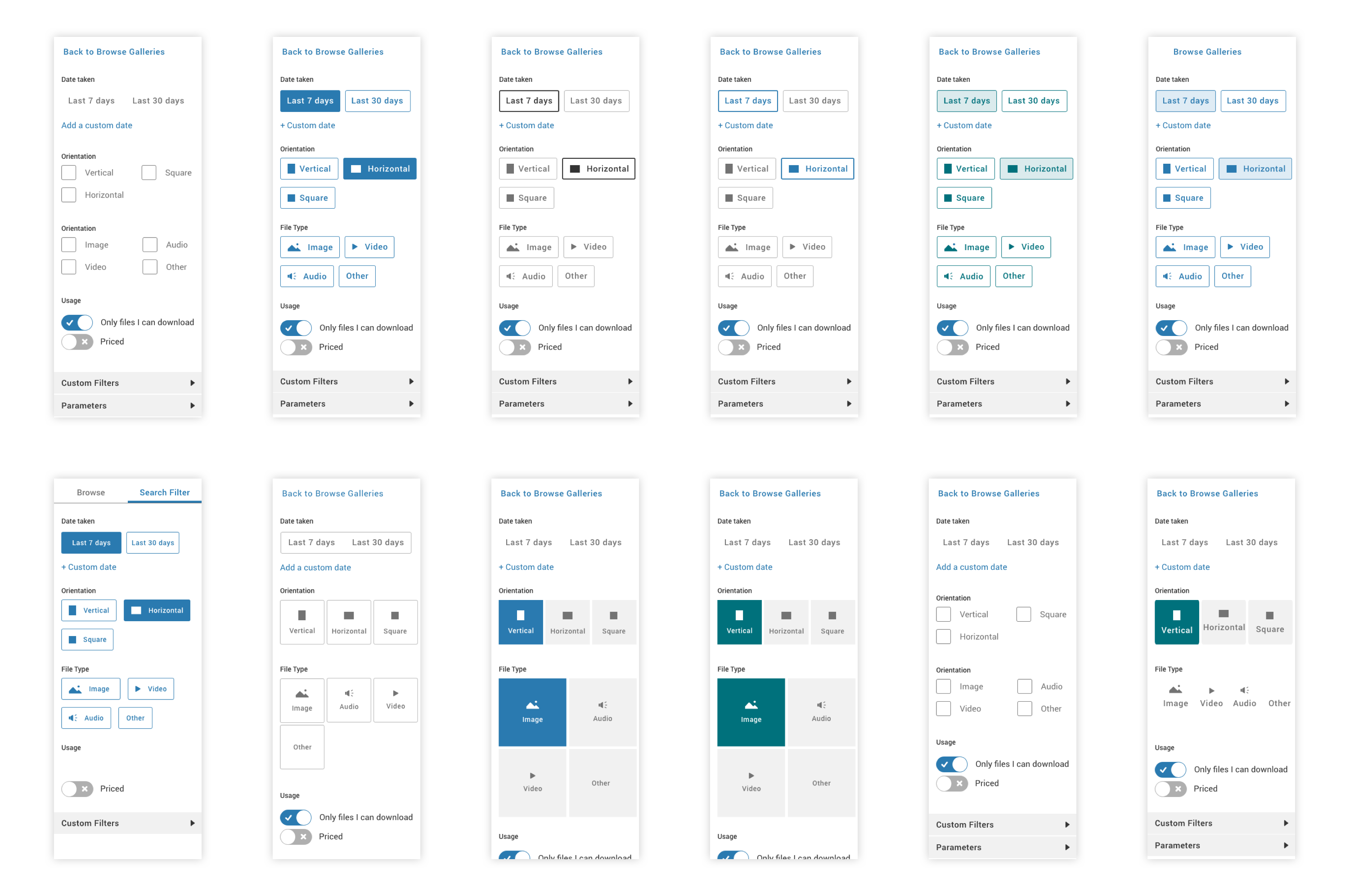
Ideation
Usability testing
Task 1
Search for a “summer” image
"You are putting together a departmental faculty newsletter and are looking for an image of campus activities in the summer. Please show me how you would find an image."
Task 2
Filter out everything but horizontal images
"You are specifically looking for an image that would work well as a hero image, across the top of the newsletter. Show me how you might find images that would work well in that context."
Task 3
Return to browse, then search again
"If you want to see all the galleries and collections you have access to, how would you do that?" (Browse to a gallery) "If you were to search for “summer” images now, what would you expect to happen?"
Takeaways
1. Reconsider filter icon placement for increased discoverability
2. Improve filter logic to align with users' mental model
3. Rename "Custom Filters" to clarify section contents
4. Address "search within gallery" feature in a subsequent phase
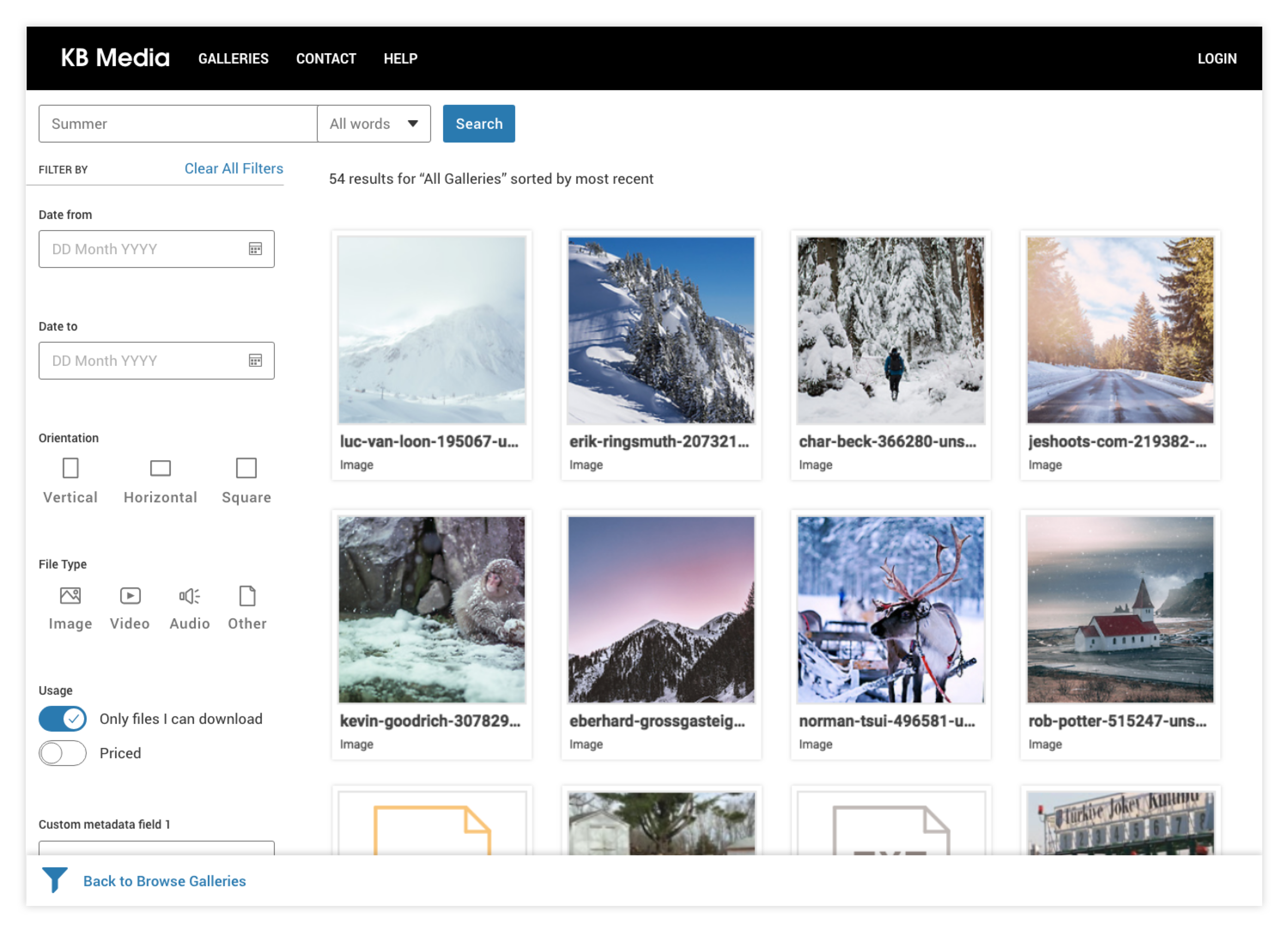
Final design

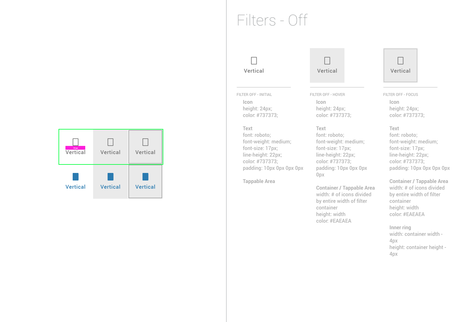
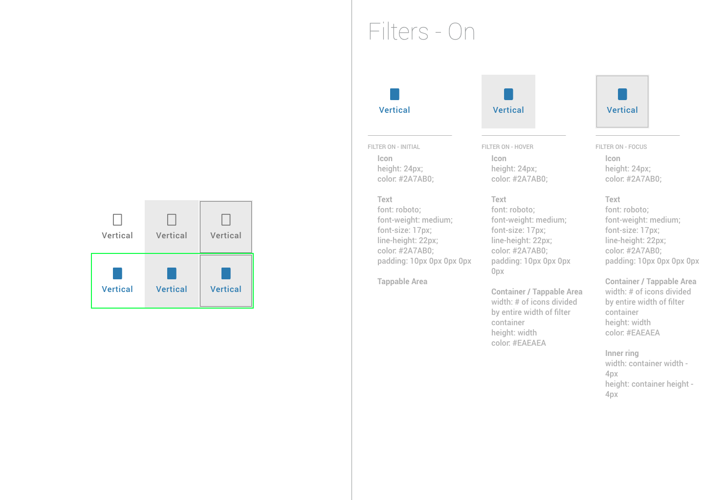
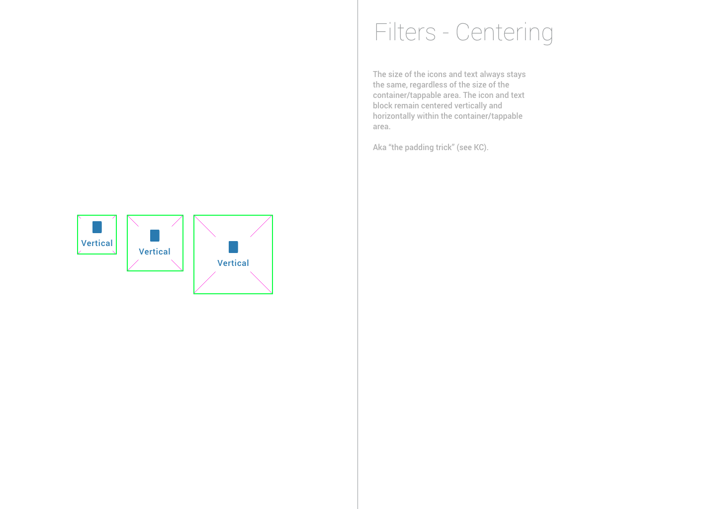
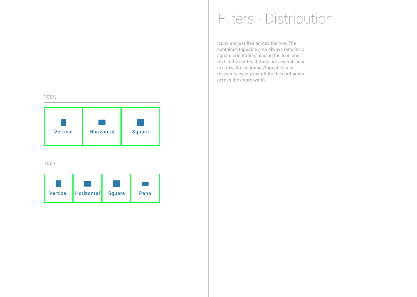
UI specs
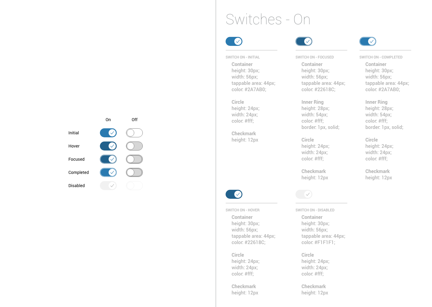
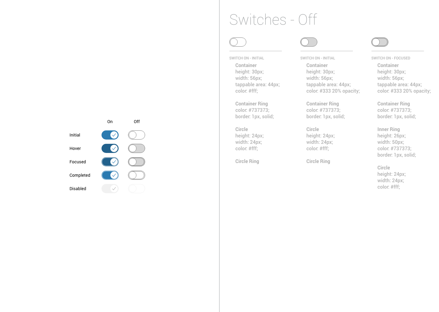
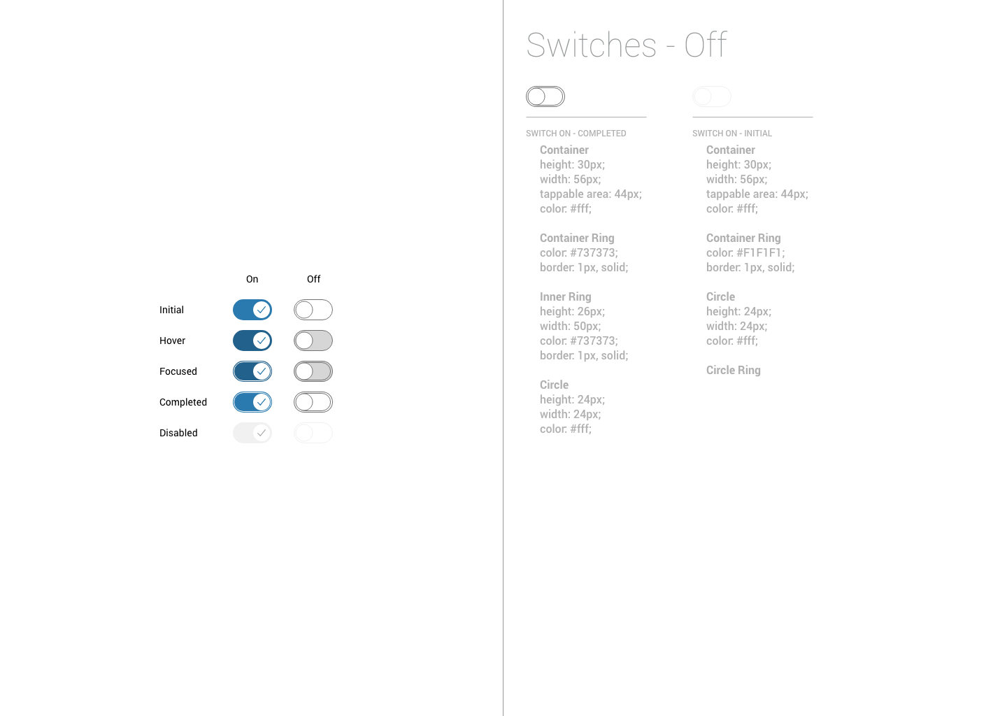
Designed by Kim Burgas & licensed under a Creative Commons Attribution-NonCommercial-ShareAlike 4.0 International License.
Designed by Kim Burgas & licensed under a Creative Commons Attribution-NonCommercial-ShareAlike 4.0 International License.
